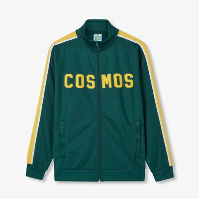
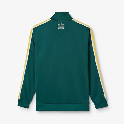
New York Cosmos And Their Iconic Green and Yellow

The New York Cosmos and green and yellow go hand in hand. For generations of fans, those colours evoke memories of Pelé and the glamour of soccer's golden age in America.
For Clive Toye, the founding general manager of the New York Cosmos, there was one signing that mattered above all others: Pelé. Although the Brazilian icon had retired from professional football, Toye was convinced he could bring him to New York. More importantly, he believed Pelé could achieve something no player had done before, make America care about soccer. Millions of Americans already recognised the Brazilian's name, and Toye saw an opportunity to use that global star power to elevate the sport's profile across the United States.

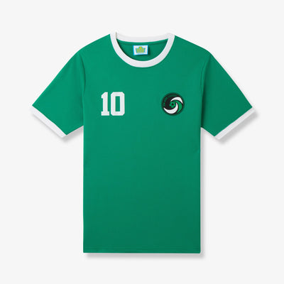
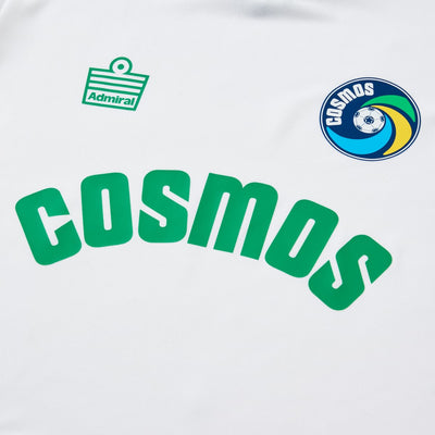
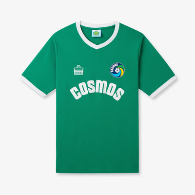
The club's early colour selection reflected this obsession with the world's greatest footballer and the most iconic colours in international football: Brazil's yellow and green home kit. It would have been easy to adopt yellow as the team's primary colour and directly mirror the famous Brazilian shirts worn on the world stage. Instead, the Cosmos chose a more nuanced approach. The club wanted to establish its own identity while maintaining an unmistakable connection to the player they were determined to sign. Green and yellow became a visual nod to Pelé rather than a direct imitation. For Toye and the Cosmos, every detail mattered in their pursuit of securing the world's most famous footballer.

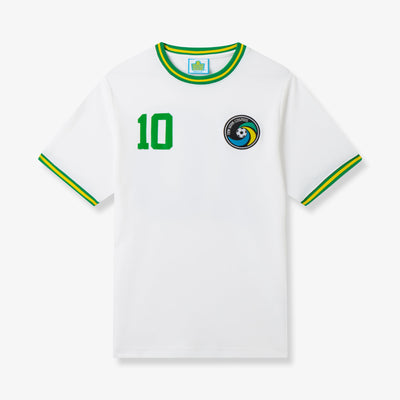
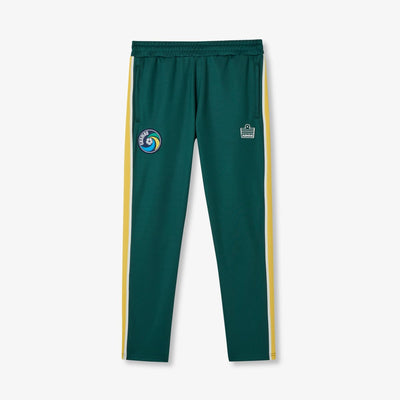
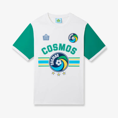
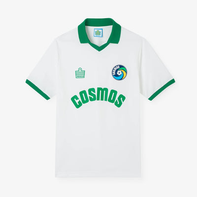
When that mission was finally accomplished, the irony was that The Cosmos took the decision to move away from green and yellow for the on-field kit. Instead, those iconic colours became the foundation of the club's wider identity, shaping its branding, imagery and culture. The playing kit was predominantly switched to white with green accents, a tribute to the iconic all-white shirts Pelé had worn throughout his legendary career with Santos, with green becoming the away shirt colour. It was another calculated move, designed to resonate with both international admirers of Pelé and new American fans discovering the sport.

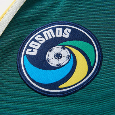
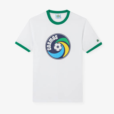
The influence of those colours extended beyond the club's branding and into its most iconic symbol: the crest. Originally designed by Wayland Moore in 1971, the badge incorporated green, yellow and blue stripes as part of the Cosmos' efforts to attract Pelé to New York. While the colours clearly paid homage to Brazil, the design carried a broader meaning. The combination was intended to reflect the multicultural spirit of New York City itself, a place where different cultures, communities and identities converge.
More than five decades later, the essence of that crest remains unchanged, preserving the story and heritage behind one of American soccer's most recognisable brands. In 2025, the club introduced a brighter shade of blue as part of a modern refresh, but the badge's core design continues to honour the same history and ambition that inspired it from the very beginning.
Featured Items